


News / Events
Colors meant for heating up winter
06/11/2013
Colors strongly influence our state of mind, we know that! In this period, particularly, our mood has to confront with a range of dark and opaque shades, typically winter season’ colors. However, winter chromatic effects happily matches with fashion colored grandeur of clothes, accessories and home décor.
Colors’ choice is a very subjective and personal moment taking inspiration from everyone’s personality. There are, though, some general rules that help us when we have to select colors depending on the effects they produce on our psyche.
Choosing the right colors, indeed, objects, textiles and window treatment curtains as well as every other furnishing complement can be converted into support for our health or our activities. Our bedroom, for example, is suitable for colors promoting relax, such as light yellow which convey a quiet and warm atmosphere or some blue touches slowing down our heartbeats and breath.
White is the color of the kitchen because of the idea of cleanliness this color conveys together with yellow and its inner good mood and some red touches stimulating blood flow and appetite, too.
Yellow is suitable for a studio, too, because it promotes concentration and creativity.
Pastel colors, on the other hand, are the best choice for settings like bathrooms. Green and pink inspire body care. Pastel colors such as bright blue or turquoise or pink are perfect for your kids’ bedrooms, too, because they stimulate their fantasy and attitude towards games.
Most of the chromatic suggestions for winter 2013-2014 come from fashion world...
One of the leading colors of winter 2013 is maroon. There will be fuchsia, too. Perfect for its matches with black or a very dark grey shade. Blue is the other great protagonist of this winter season. If emerald green was the 2013 must have, it should keep imposing its presence in winter 2013 as the leading fashion color but it should have new shades. Lively shades are substituted by newer nuances, that’s to say, dark and intense forest green ones or more classical shades such as hunter green tending to grey. A reference to red must be taken into account, as long as summer memories such as light pink, light grey and white.
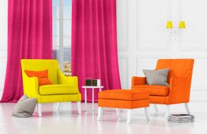
Here it is a picture of the new chromatic proposal for all the settings in your house. It’s about our new product PRINT, from Magazine collection.
With PRINT line, CTA proposes two 100% linen variants; one more full-bodied, substantial, suitable for a lighter padding, cushions or bedcovers; the other, a lighter one it’s ideal for interior décor, to window treatment curtains, in other words. PRINT is a very particular line because fabrics are made with innovative and very precise finishing techniques which improve natural fibers’ features, making then softer and velvety as you touch them. It’s about a very accurate process through the ‘stone-washed’ technique which gives a worn-out and a softer effect to the cloth. Natural and precious at the same time.